General parts of the user interface
The user interface consists of three main parts:
-
The sidebar contains the available XDM object categories and lists.
-
The head bar contains global information and actions.
-
The main area shows information and actions on the current object.
The Side Bar
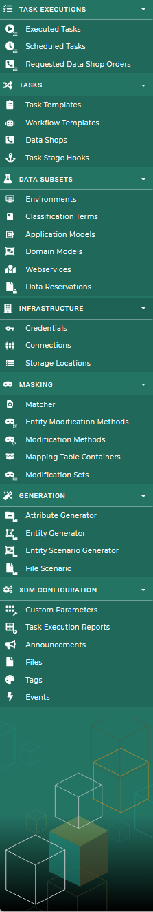
The sidebar contains the main navigation menu.The global available entity lists are grouped into six categories:
-
Task Executions: This category contains the overviews of the running, executed, scheduled and requested task executions.
-
Task: This category contains all objects related to tasks and task templates.
-
Infrastructure: This category contains all objects that represent some sort of infrastructure object in the customer’s data center.
-
Data Subsets: The objects required to work with row level processing and to model the customer’s application landscape.
-
Masking: This category contains all the objects that define masking and data manipulation.
-
Generation: This category contains all the objects related to data generation.
-
XDM Configuration: This category contains global XDM configuration objects used in various other objects.
A category is only shown if the user has read permission for at least one entry in that category.
The sidebar can be docked to the left side of the screen to have more room for the main area. The single categories can be expanded and collapsed. Both settings are stored in the user’s profile and can be aligned individually for every client.
The XDM logo on the top left always navigates back to the dashboard.
The Head Bar
The head bar contains general information and global actions.

From left to right there is:
- XDM Logo and Name
-
Navigates to the dashboard.
- Global search
-
if configured in installation
- Announcements
-
Displays one active announcement below the head bar. An active maintenance announcement takes precedence. Otherwise, the most recently published active announcement for the head bar is displayed.
- Notification Center
-
This provides a centralized overview of all notifications, ensuring they remain accessible even after disappearing as toast messages.
- Navigation Menu
-
The Navigation drop down in the head bar offers quick access to various resources. Each link opens in a new tab to avoid disrupting your current session.
-
Purchaser Layout: Opens the purchaser layout in a new tab.
-
User manual: Opens the XDM user manual in a new tab.
-
Grafana: Opens the report dashboard in a new tab. Visible if grafana is configured in the XDM installation.
-
- System Menu
-
The System drop down provides access to key functionalities for managing and customizing the application.
-
System Settings: Configure application preferences and manage system related options.
-
Import: Opens the import options. On the import side, XDM configuration objects can be created by importing files (*.yaml). The export action of the individual XDM configuration objects can create YAML and ZIP files for the import. Refer to configuration of export for more information.
-
About: Shows the version of the currently used
xdm3-ui. Also internal and external contact information is displayed.
-
- User Menu
-
The User drop down is personalized with the logged-in user’s name and provides quick access to account-related actions. When the user is a global admin, the icon is highlighted in UBS corporate colors for easy identification.
-
User Settings: Manage your personal preferences and view your account details.
-
Sign Out: Exits the current session and leads back to the login screen.
-
Underneath there is:
- Breadcrumbs
-
This shows the path to the currently displayed object. Each item can be used as a link to change to the object. When navigating up in the list, the previous deeper list persists. It’s possible to navigate up and down the currently displayed path of objects.
The Main Area
The main area shows the current object. At the top is the title and to the left of this are two navigation buttons:
- Back
-
Navigates back to the previously visited page.
- Up
-
Navigates one level up in the current object hierarchy. This is always the resource listed before the current object in the breadcrumbs.
On the right-hand side there are additional actions:
- Mark as favorite/bookmark
-
Marks the current object as favorite (or bookmark, this depends on the chosen browser). All favorites are listed on the dashboard.
- Contextual help
-
Opens a brief description of the current object and links to the corresponding chapter in the user manual.
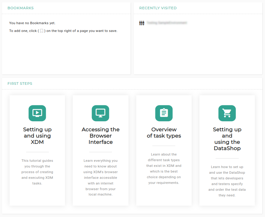
The Dashboard
The dashboard shows the published announcements, the latest executions for the installation, the tasks waiting for approval, the recently visited objects, the user’s favorites/bookmarks and first steps with links to the user manual of XDM.
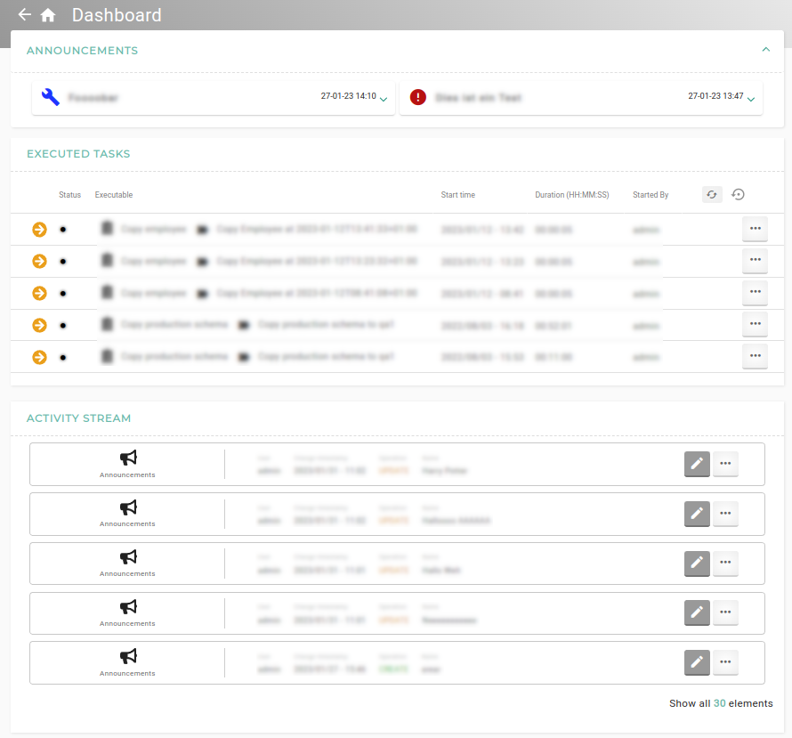
- Announcements
-
There are listed all announcements that should be displayed on the dashboard only or on the dashboard and in the head bar.
- Executed Tasks
-
This list shows the latest executions for the installation and the user can change directly to the Task or Template.
- Tasks waiting for approval
-
All objects that are waiting for approval are listed here.
- Recently visited
-
This list shows a history of the recently visited objects by the current user. The information is stored in the browser.
- Favorites/Bookmarks
-
This list shows the current user’s favorites/bookmarks. The data is stored in the user’s browser.
An object or list can be added to the favorites/bookmarks by clicking the appropriate icon on the right-hand side of the title bar, when the list or entity is shown.
- First steps
-
This shows some tutorials about XDM and how to set it up correctly.
The Object Preview
The object preview shows a preview of the object with all the information about it.
It gives the user the ability to open up a preview of an object without leaving the actual page and to
navigate from one preview to another one or back ( ) to the last preview.
The user can navigate through all settings of the object, but it is not possible to edit something in the preview,
for this the user needs to open up the edit mode (
) to the last preview.
The user can navigate through all settings of the object, but it is not possible to edit something in the preview,
for this the user needs to open up the edit mode ( ).
).
- Open the object preview
-
The preview of an object is accessible via the object name that gets highlighted by hover over it or by the bold display name in a list view.
- Object preview navigation
-
The navigation is located in the right upper corner in the preview window.
-
The back button (
) navigates to the last preview of the object. -
The object can be directly accessed by the button (
 ).
). -
The edit mode of the object can be accessed by the edit button (
). -
The button with 3 dots (
 ) can be used to access more actions.
-
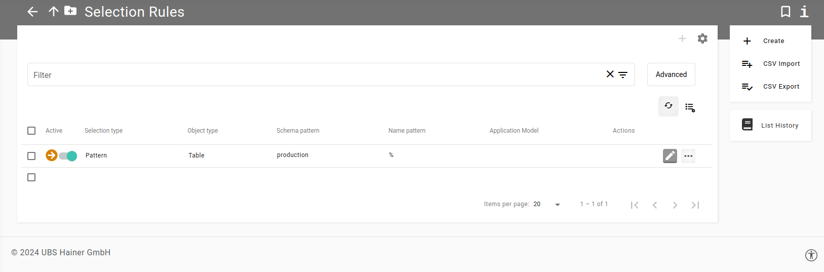
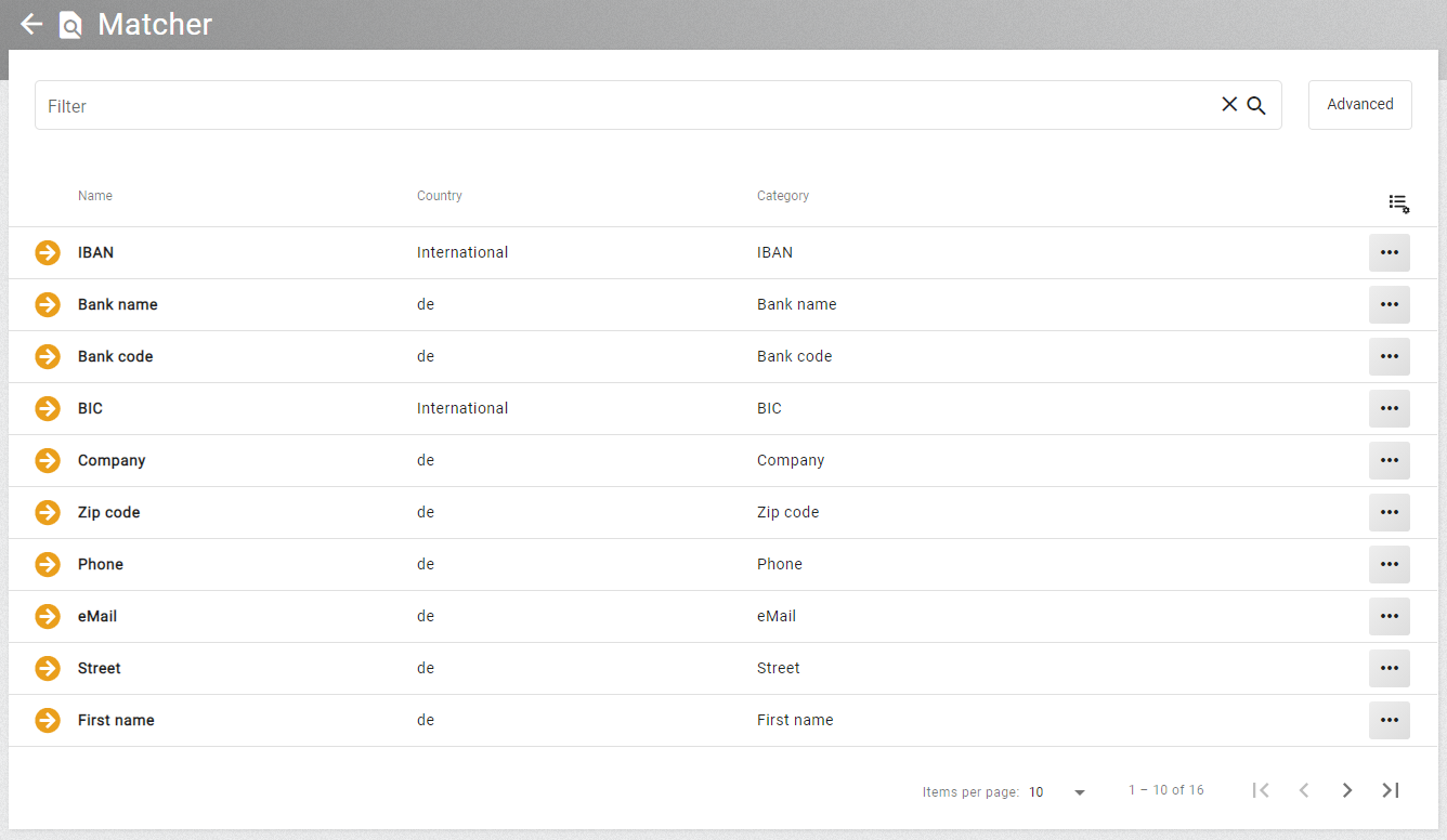
The List View
List views are used when browsing a list resource. These lists support paging, filtering, and sorting. Whether a certain operation is supported depends on the capabilities of the list resource.
Depending on the size of the list resource, the display will show a limited number of entries. The number of entries shown per page depends on the specified page size. The user can change pages and vary the page size at bottom of the current page.
The sort order of the list can be controlled by clicking a column header. Initially the column will be in ascending order and with a second click will switch to descending order.
The columns that are displayed can be edited in the Customize list columns option. This can be found in the menu by clicking on
the list settings icon ( ) in the upper right corner.
This makes it possible, for example, to display fewer columns in a lower screen resolution or to add more columns that can be useful to sort by.
) in the upper right corner.
This makes it possible, for example, to display fewer columns in a lower screen resolution or to add more columns that can be useful to sort by.
The content of an object can be directly opened by clicking on the () in the list.
All settings of paging, sorting and filtering will be stored for an individual list resource in the user’s browser store. That means, whenever revisiting a list resource it will be displayed in the same manner. The user can reset the settings using the list settings button. In the user settings it is also possible to disable the storing of list settings globally.
The width of the columns can be changed using drag and drop. The width is stored per entity type and restored when the list is opened again. The setting can be reset with the button in the upper right corner of the list.
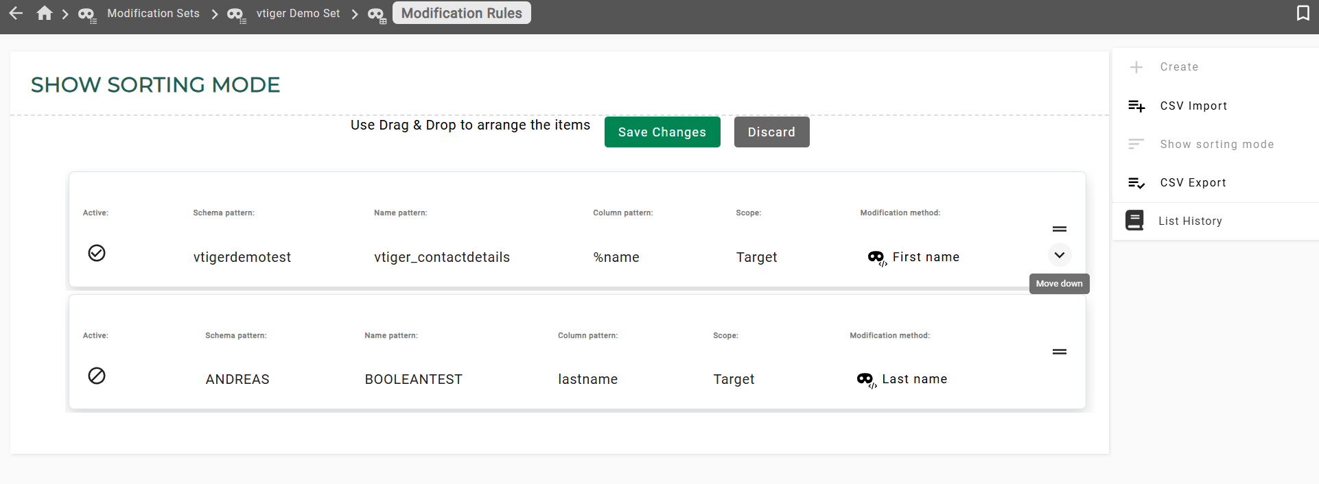
List sorting mode
If a list is sortable, the elements can be arranged in sorting mode by dragging or using the keyboard. Each movable element has a visible drag area that displays directional arrows on hover or focus, facilitating keyboard users interaction. After saving the changes, the elements are ordered in the list.
List filter
The filtering is controlled by the filter bar at the top of the list. When entering a text, the filter will be applied to the display name of the objects. If the object has no display name property another column is picked automatically. The user can use custom search terms to narrow their filter. The search term consists of a property name, an operator, and a value. It is possible to build a custom filter by using the Advanced button to the right of the filter bar, selecting a property and an operator, and entering a value.
Escape special characters
Some special characters must be escaped with a backslash in a simple filter. However, in an advanced filter, the escape is done automatically.
For the comma, specifically, it requires two backslashes \\ for proper escaping."
| Special character | Escaped special character |
|---|---|
|
|
|
|
|
|
|
|
|
|
|
|
|
|
The Quick view
This chapter describes what quick views are, how to define and how to use them.
What are Quick views?
A quick view is collection of defined filter attributes. They assist the user to have a shortened and detailed view which only shows necessary data on list. Quick views are available on each list which can be filtered. A quick view can have no, one or more filter characteristics. Individual characteristics can switch to active or inactive on demand by filter chips. Lists can be used like usual after using quick views (selection, sorting,aso).
Filter chips
A filter chip is a quick possibility to switch a filter attribute active or inactive. Filter chips are above the filter. Inactive filter are marked by a gray background and active are colored.
Filter chips are automatically created after building a filter attribute. Is a filter chip active, the expression of it, is also in the filter field visible. In case of more than one active filter chip, the expression of all filter characteristics are written in this field, separated by a comma. The execution of the expression happens in conjunction (AND).
Filter attribute
A single filter attribute consists a name and an expression.
-
Name specifies the name of the filter attribute, is shown as filter chip notation.
-
Expression the filter expression
The name is the notation of the filter chip, after building the attribute. Use significant, powerful names, it will help you find and use the filter attribute later on.
Configure QuickView
To configure filter attributes for a specific list, navigate to that list. On top the filter is displayed.

There are different ways to configure a filter attribute for a quick view:
Add after filtering
A common method to configure a filter is to create a filter string by the filter field. Use the advanced or the simple filter to create your individual filter string. After preparation of your individual filter click on the 'magnifier' icon next to the prepared string. After first execution of the filter the + on the right, above the filter is activated. Click on it. The popup 'Add quick view' appears. The expression field is automatically filled by the created filter expression from the filter field. It is possible to edit the string. Choose a name for the filter attribute and write it in the field name. If the name field is filled and the expression is correct, the Apply button is enabled, to save the attribute. Click on it. The popup closes and above the filter chip is available.
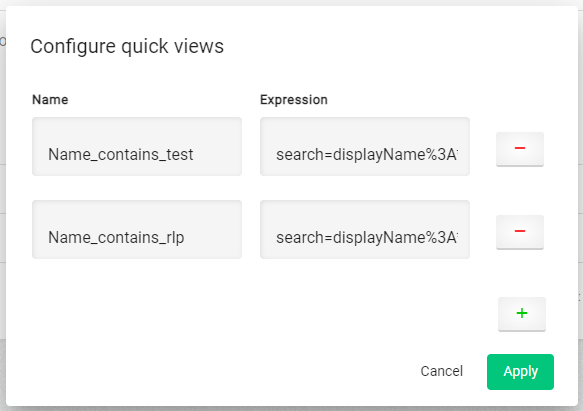
Manual creation
To create a filter manual, click on the gear, next to the + icon on top of the filter. The popup 'Configure quick views' opens. By clicking the green + button, a new row with name and expression field is built. Fill the fields. In case the name is filled and the manual tipped expression is correct the button Apply among the green + is enabled. Click on it. The popup closes and above the filter chip is available.
Expression Example
The expression should be based on url encoding. If the status COMPLETED is to be filtered, a valid expression could look like the following:
search=status%3ACOMPLETE&Another example, which includes sorting, could look like this:
sort=status%3Aasc&search=status%3ACOMPLETE&Configuration
To configure the filter, click on the gear, next to the + icon on top of the filter. The popup 'Configuration quick views' appears. Now you can create, edit or remove a filter attribute.
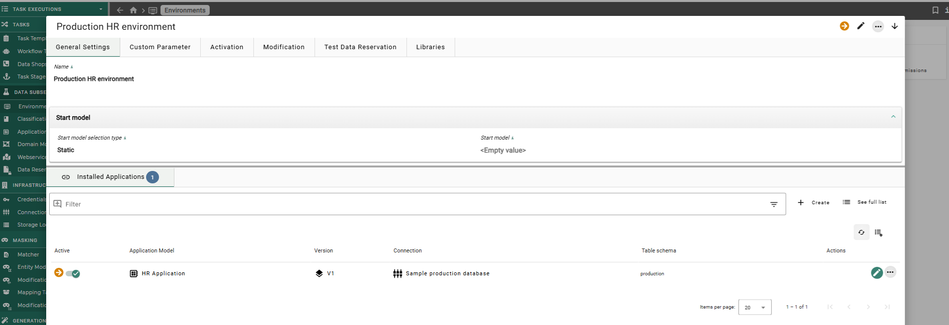
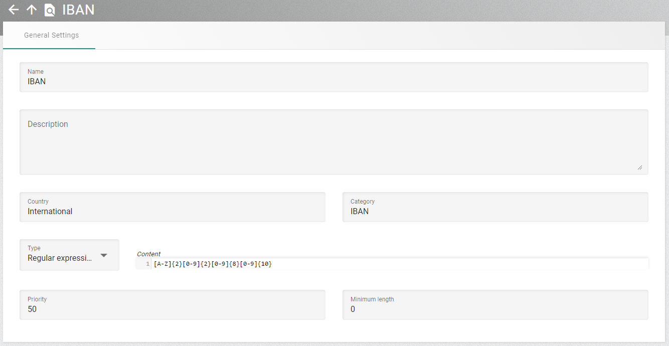
The Entity View
When visiting a distinct object the entity view is used.
The entity view shows all the entity’s properties separated into multiple tabs. Inside each tab there is a main panel and optionally multiple additional panels that can be expanded and collapsed.
The entity view has two different modes, the view mode and the edit mode. Only users with write permission for an entity can switch to the edit mode.
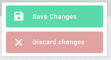
The user can change to the edit mode, by using the edit action on the entity view or by clicking the edit icon for an entity in a list. When viewing the entity in edit mode, the properties are editable. Some properties might be not editable depending on the settings of other properties. They can become active if one of those other properties is changed so that it makes sense to edit the previously disabled property. When changes are successfully saved the user will receive a message, and the entity display switches back to the view mode.
The user can leave the edit mode with the Save or Discard action. When they save changes the data will be sent to the XDM core service. This checks that the data is valid. If invalid data has been entered, then a message is returned, and in most cases the tab will switch to the first property with invalid values. Using the discard option abandons the changes, and the entity display switches back to the view mode.
The entities use different components to control the inputs. Most of the inputs are used in multiple places. The following list describes these components and their functionality. In view mode the plain value is shown, in edit mode more options become visible.
Learn about the generic control elements for the entities in the next chapter.
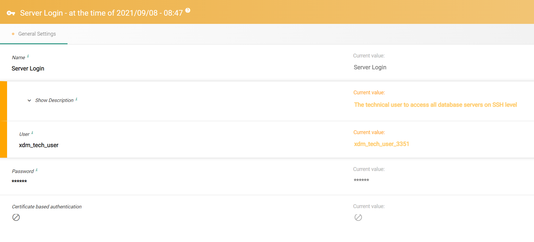
History page
The history view of changes is available for lists and specific entities. The compare page shows the values for the historic state on the left side, the current state on the right side. If the values differ, the corresponding row is highlighted. The properties are grouped by the tabs that are used in the default view and edit page. Properties resulting from custom parameters are currently not shown in the compare page.