Control Elements
Input fields
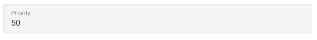
This is the simplest component. It allows entering a text, a number, or data with special syntax, depending on the constraints of the underlying setting. When an input is mandatory, or a special syntax is required the corresponding message is displayed under the input box.
Drop down lists
Drop down boxes allow the selection of a single value from a list of multiple predefined values.
Drop down boxes come in two different forms. The first is to select one of a number of fixed values. This is the case for
Drop option, Fill mode or similar XDM options. The other form is for the selection of a user defined object, for example,
to choose a credential for a connection. For all such object references an inline create button is shown, if the user has the required
permission to create new objects. The created object will be directly selected when the creation process is finished.
Afterward, the new object is listed as a selection option the next time the list is displayed.
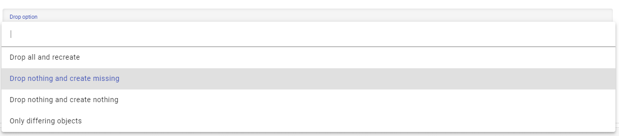
All drop down boxes allow filtering the values by their display name. To do so, set the focus on the drop down and start typing. Only the elements containing the typed string will be displayed.
Multi Reference
The multi reference component allows the selection of multiple values from a list of predefined values.
As with drop down lists, the multi reference component can either be based on a fixed list or on the user defined objects. In view mode only the selected elements are displayed.By clicking the name, a preview for the referenced object is shown.
In edit mode all elements available to be selected are listed with check boxes. Depending on the object type, the elements may be grouped by different categories, which can be expanded or collapsed. The selected elements are displayed at the top. In some cases it is possible to define the order of the selected elements using an ordering mode. To use the ordering mode, two or more elements must be selected.
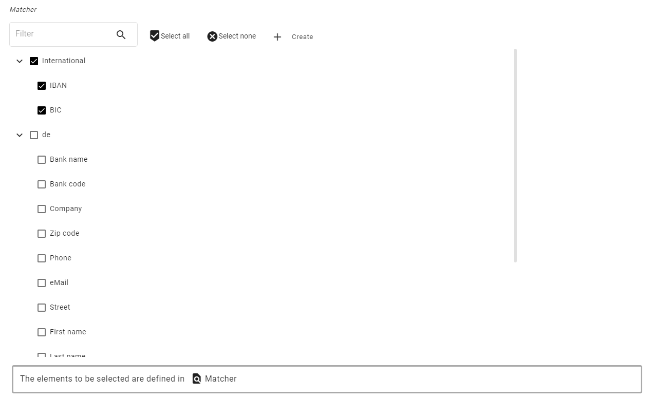
The displayed elements can be filtered. There are buttons to select all or none of the elements at once.
If the elements are based on a list of XDM configuration objects, a link to the list is displayed under the element.
Multi Selector
The multi selector component allows the selection of multiple values from a list of predefined values.
As with drop down lists, the multi reference component can either be based on a fixed list or on the user defined objects. On top, only the selected objects are displayed.
In edit mode, additional elements can be added using the drop-down element and using the add button. Existing elements can be removed using the cross behind the entry.
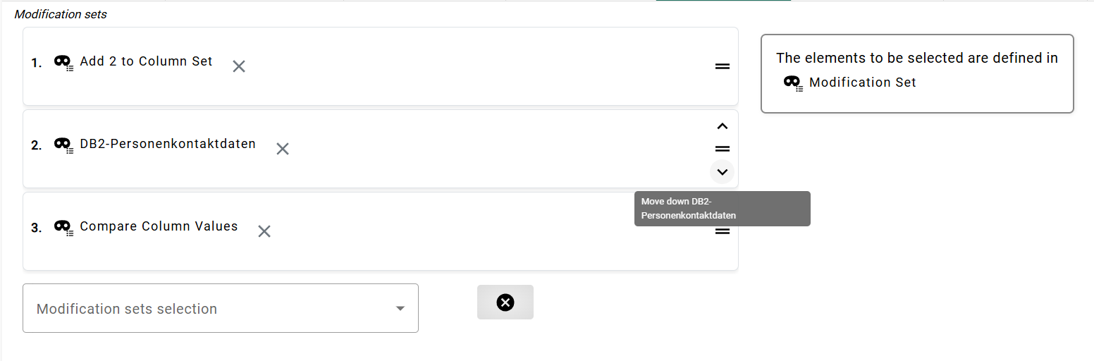
The selected elements can be arranged by dragging or using the keyboard. Each movable element has a visible drag area that displays directional arrows on hover or focus, facilitating keyboard users interaction. After clicking on a directional arrow, the element moves one line up or down in the list.
Schema and Table picker
Whenever an input box can contain database schema or table names a table picker is provided. Enter the table picker by using the 'Pick' button.

The picker opens in a new dialog. The picker allows the user to browse the catalog of a database system to pick a table. By default, XDM determines the best available connection. They can always choose another connection to find the correct schema or table name. The result of the picker will always be two strings for the schema and table respectively.
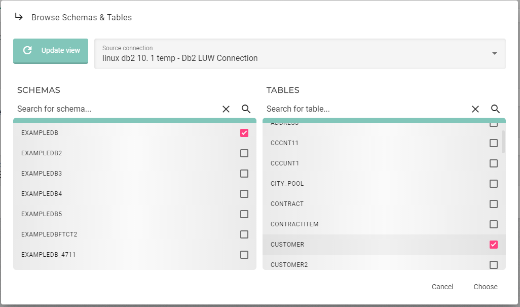
Depending on the elements to be filled, it is possible that only the schema list is visible, or only the table list is displayed once the schema has been selected. The schema and table list can be filtered. The schema can already be selected in the filter. This depends on the object to configure and on the settings of this object.
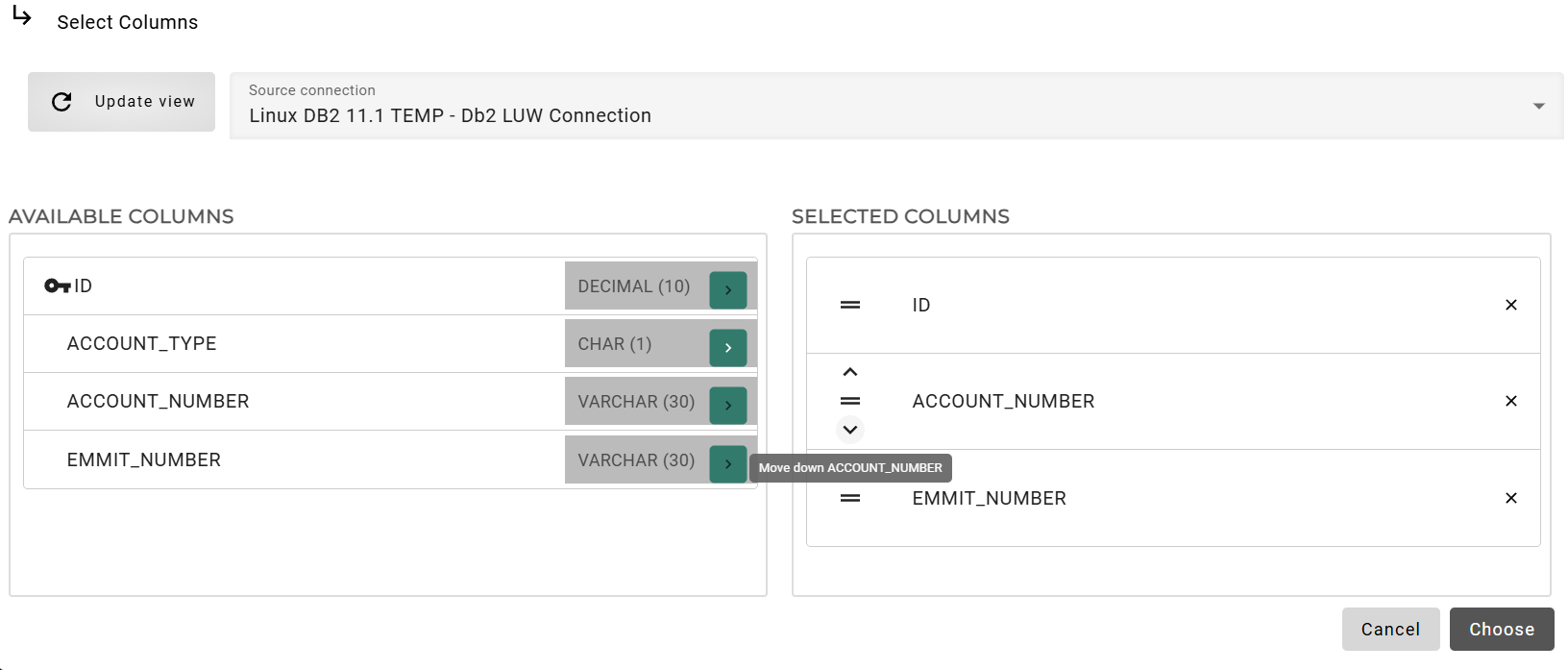
Column Picker
Like the table picker, the column picker allows the user to browse their database catalog. The column picker will let them select one or more columns depending on the underlying object. When selecting multiple columns, the ordering of the columns can be set by dragging or using the keyboard on the right-hand list. For keyboard users, each movable element has a visible drag area that displays directional arrows on hover or focus. After clicking on the arrow, the element moves one line up or down in the list.
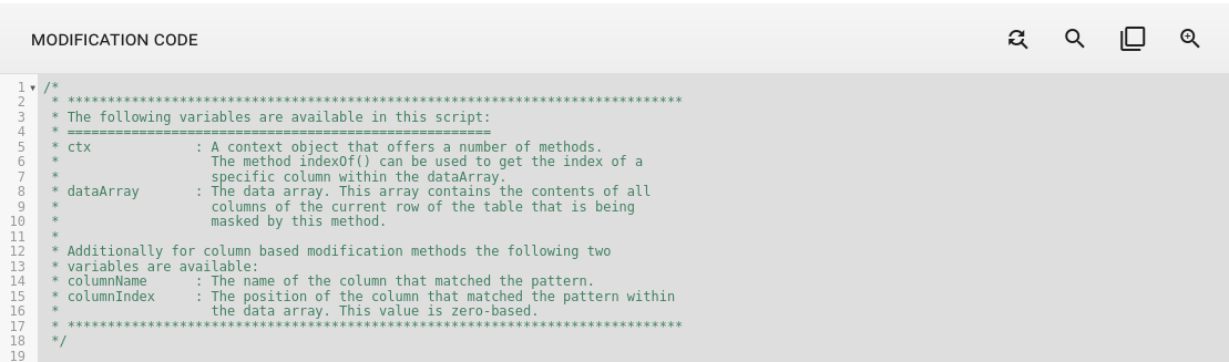
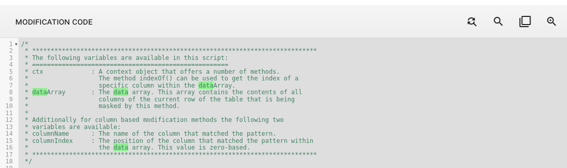
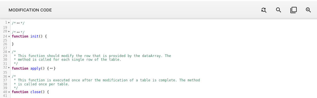
Code editors
For most entities, code is entered in an editor based on code mirror. This editor has some features which are helpful when entering code. In all editors that accept JavaScript, syntax highlighting is enabled. When appropriate, indentation is also automatically applied after line breaks.
Log outputs of a task are also displayed in the code editor, but are not editable.
It is possible search in the code editor by using Ctrl+F and entering the search term. Start the search by pressing Enter. The search can use regular expressions. The user can search for the next occurrence by pressing Ctrl+G.
The user can find and replace any term in the code editor using the search panel. By clicking the search icon, they can enter a search term and specify the replacement term. The panel allows them to review each occurrence individually and choose whether to replace it with the new term.
The user can mark any part of the code inside the editor, and the editor will highlight everything that matches the marked character.
There are also fold gutters available in the code editor. The user can fold any code block by clicking the arrow next to it, or by pressing Ctrl+G to fold the block their cursor is currently in. To fold all code block press Ctrl+Alt+[ and to unfold press Ctrl+Alt+].
The user can use the Tab for indentation in code editor while in edit mode. To exit the editor, press ESC, after which the Tab will navigate to the next UI element.